




Customization Guide
Stub

|
Above is the same size nib after a regrind to Stub. A regrind to Stub is often a good place to start for your first customization. A Stub nib provides broad down-strokes and narrow cross-strokes while writing, and is less position-sensitive on the paper than the crisper and slightly more demanding cursive italic.
|
Cursive Italic

|
More demanding, but also providing crisper edges and more line-width variation, is the very popular customization to Cursive Italic. This also provides broad down-strokes and narrow cross-strokes, but is also more position-sensitive in terms of how the pen is held and requires more skill on the part of the user. This is a common customization for artists and calligraphers, but is still smooth enough to make for a good everyday writer.
|
Formal Italic
 |
Formal Italic is an even crisper and more demanding customization than either cursive italic or left oblique, and is usually utilized for calligraphy and by the most experienced users. This provides broad down-strokes and narrow cross-strokes, with even crisper corners and edges than a cursive italic - this is an extremely position-sensitive customization.
|
Left Oblique
 |
Commonly used for signatures and correspondence, the Left Oblique customization provides broad diagonal strokes and narrow cross-strokes, and like a cursive italic, is more position-sensitive and demanding than a stub. The whole pen must be rotated to the left in order to write smoothly, without skipping. The "Left" in Left Oblique refers to the cut of the nib itself, and does not refer to the handedness of the writer. |
Architect's Point (Also for Arabic and Hebraic writing)
 |
A more exotic regrind is that to Architect’s Point. Named after the style of writing used by Frank Lloyd Wright, this regrind is the opposite of cursive italic, and provides for broad cross-strokes and narrow down-strokes. This also tends to be a particularly useful customization for those practicing Arabic or Hebraic calligraphy. |
Spencerian
 |
Perhaps our most popular customization, but also one of the most advanced, the Mottishaw Spencerian Customization has gained special attention from being featured in a customer's YouTube video which has now received over twelve million views! The Spencerian starts from a semi-soft 14k nib and adds additional flex and a regrind to needlepoint to create a specialized writing point used for copperplate calligraphy. For more details, visit our special Spencerian page.. |
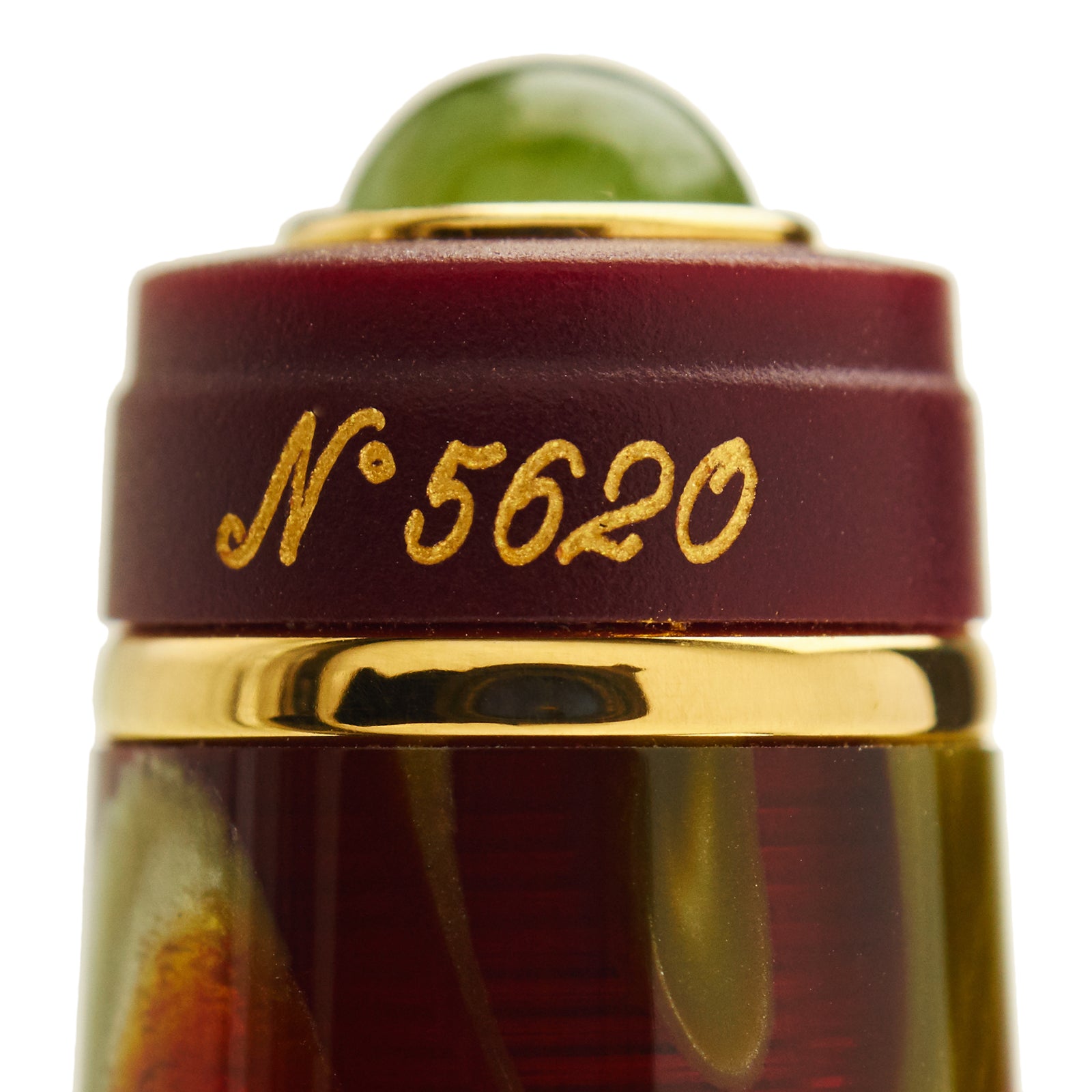
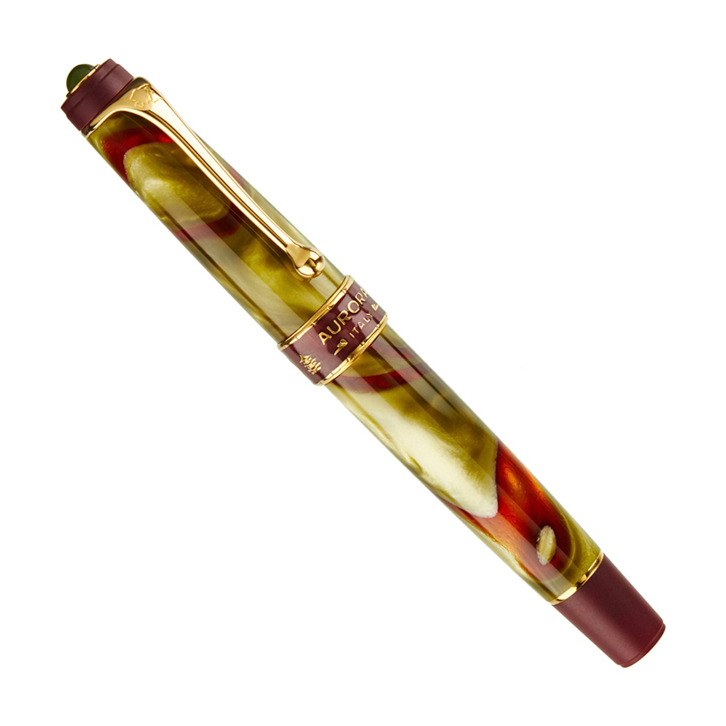
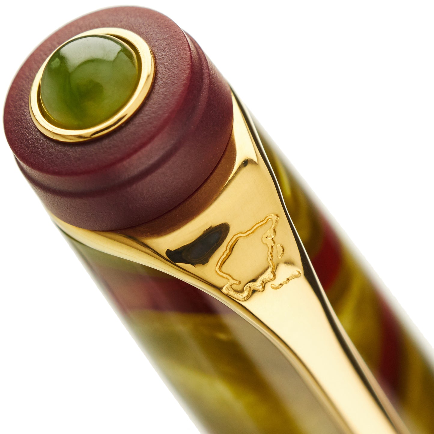
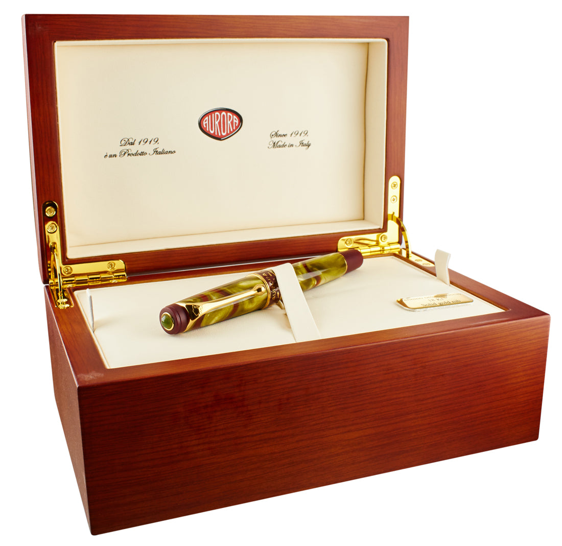
One of the most beautiful and distinctive pens in the Aurora Continents series, the Asia is a study in dark green and brown, accented by a jade cabochon on the top of the cap crown.
Aurora's limited edition Continents series offers superb piston-filler pens in a colorful array of styles. Not just for the collector, these are pens that are also excellent everday writing instruments.
The swirls of jade and burgundy are unique to each pen. No two of these limited edition pens are exactly the same.
The burgundy is semi-transparent and offers a veiled glimpse into the filling system - Aurora's generous and reliable piston-filler.
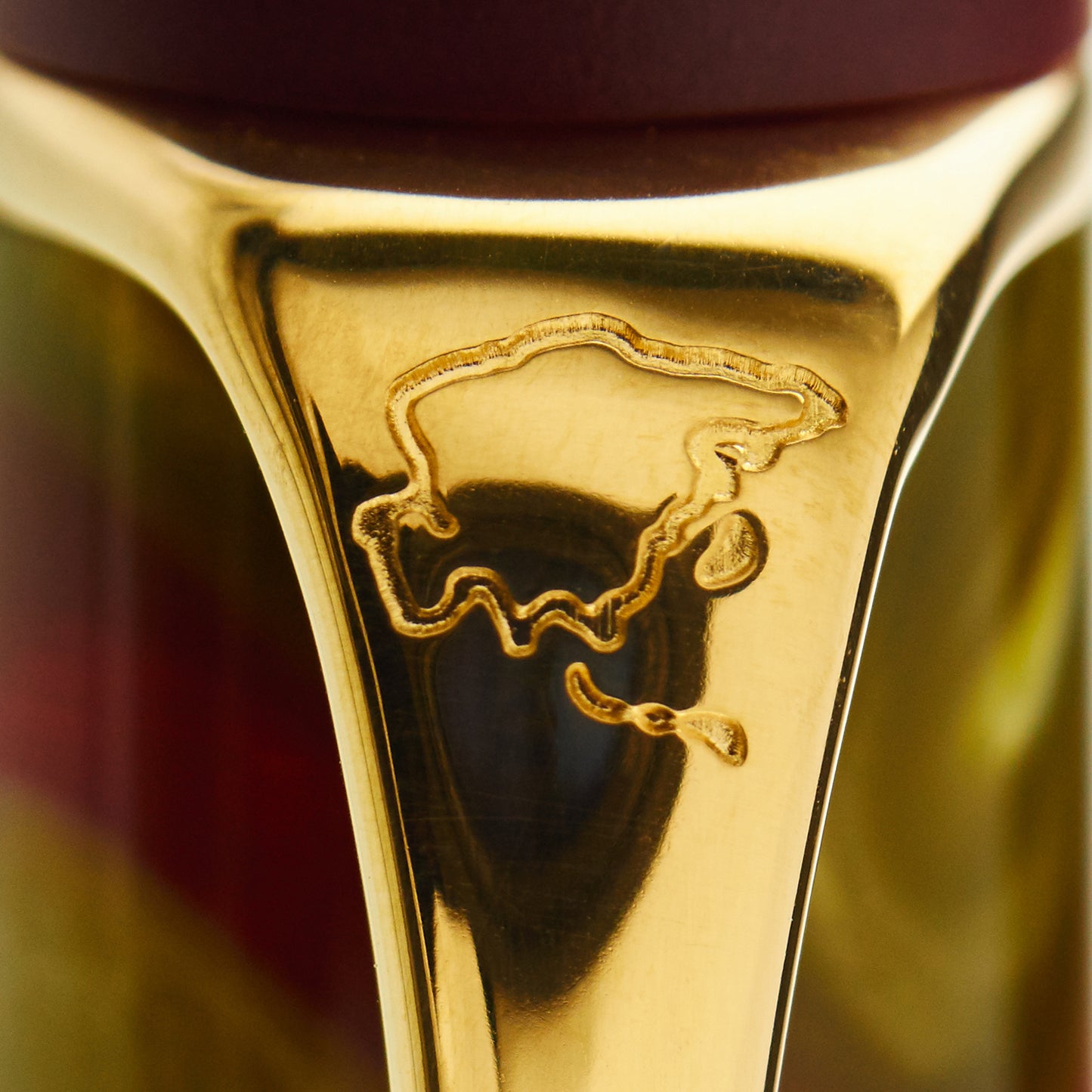
An outline of the continent of Asia is imprinted on the top of pocket clip.
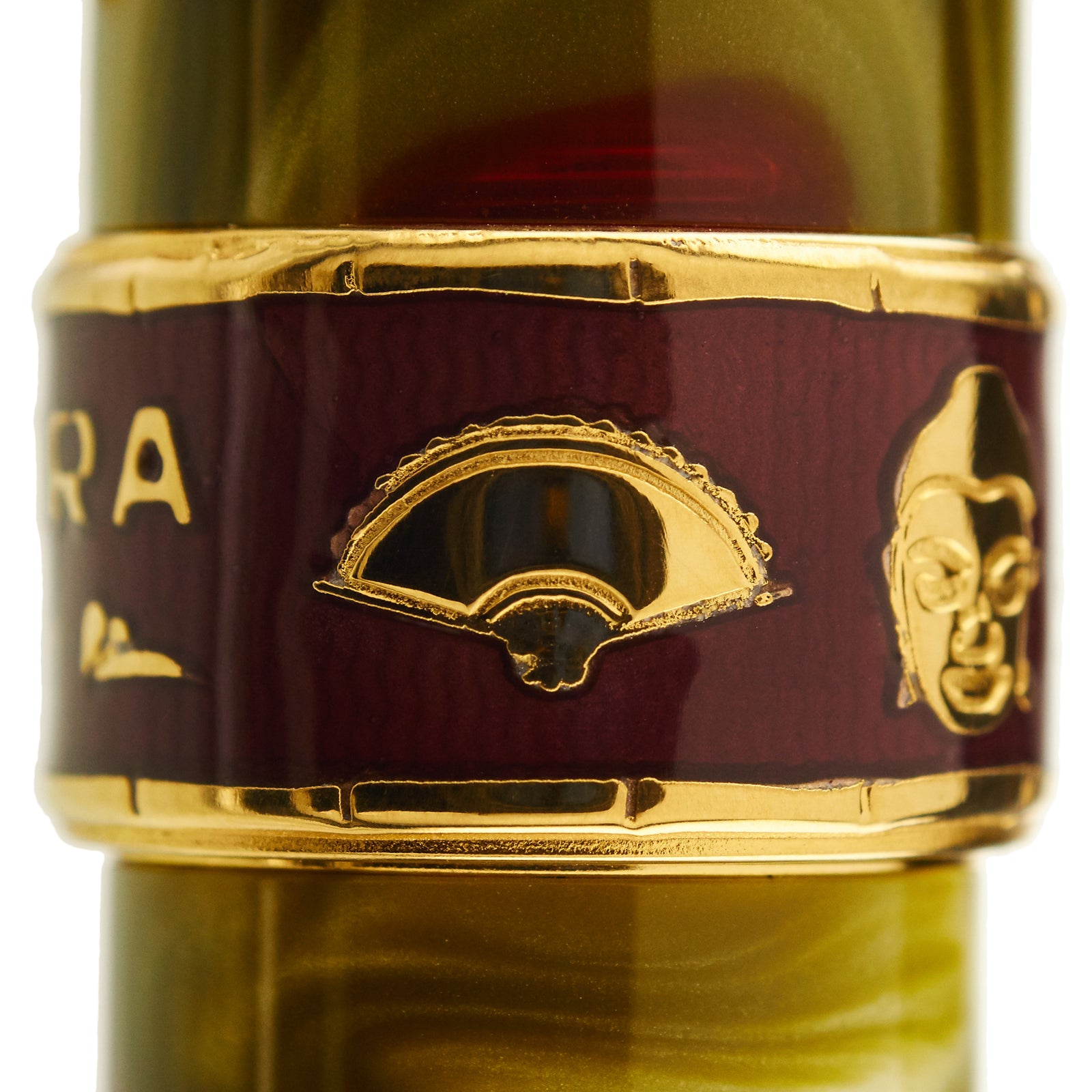
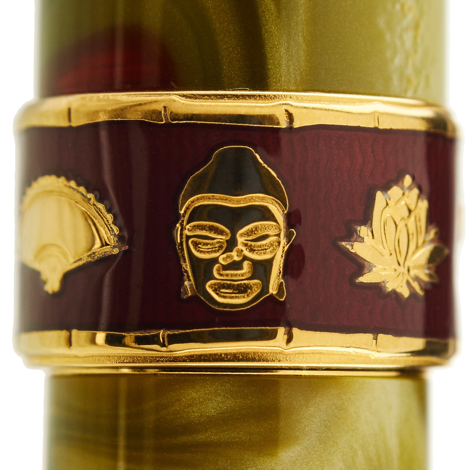
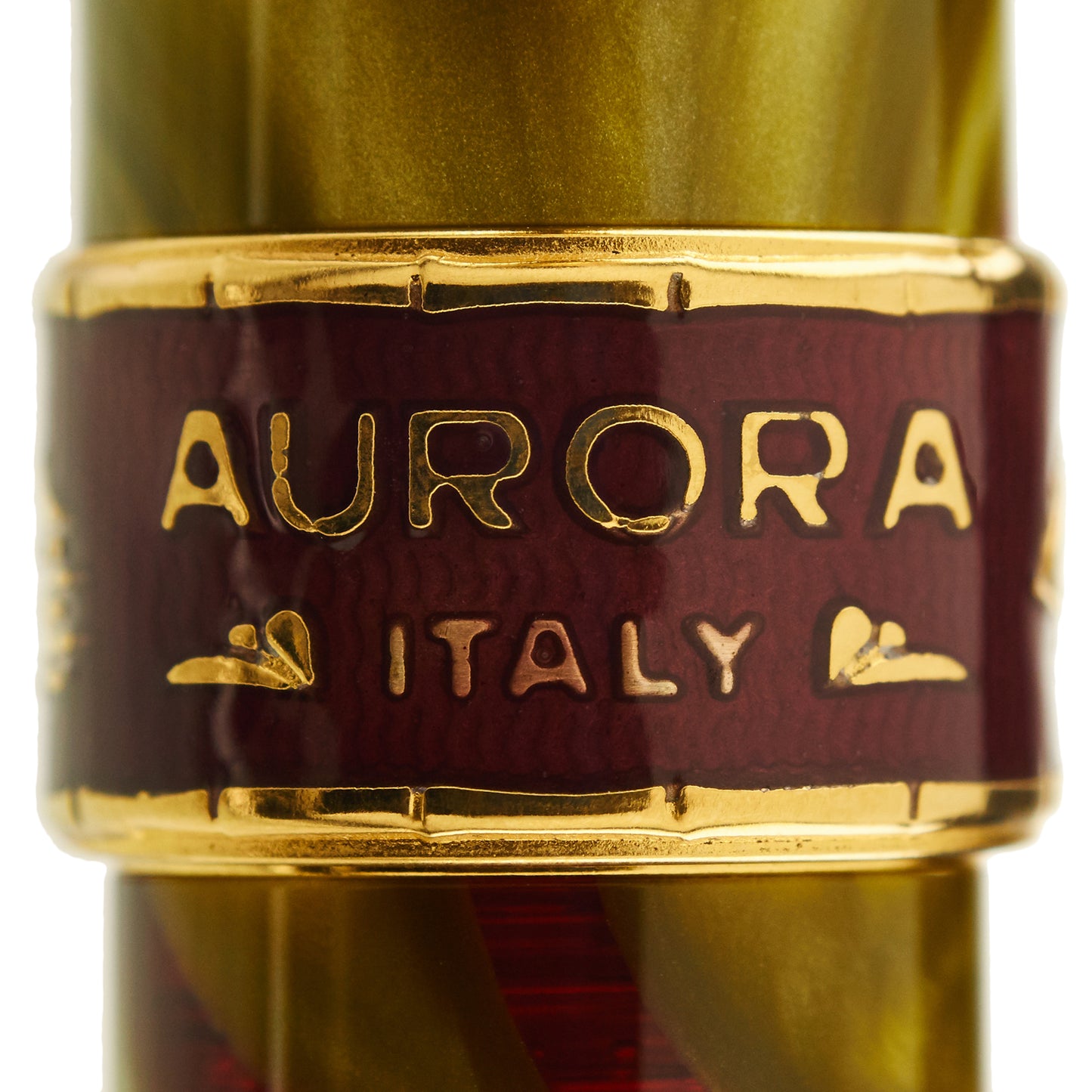
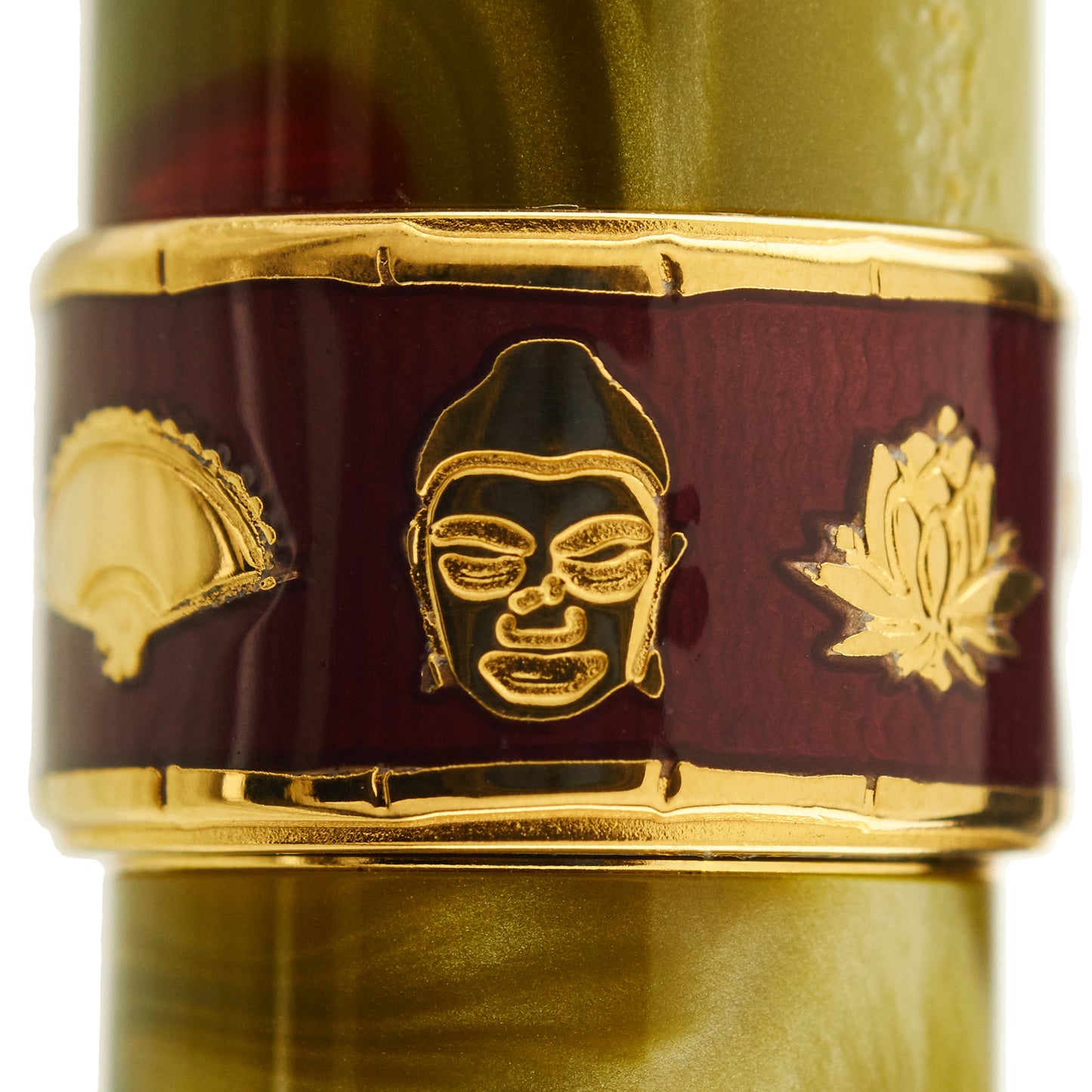
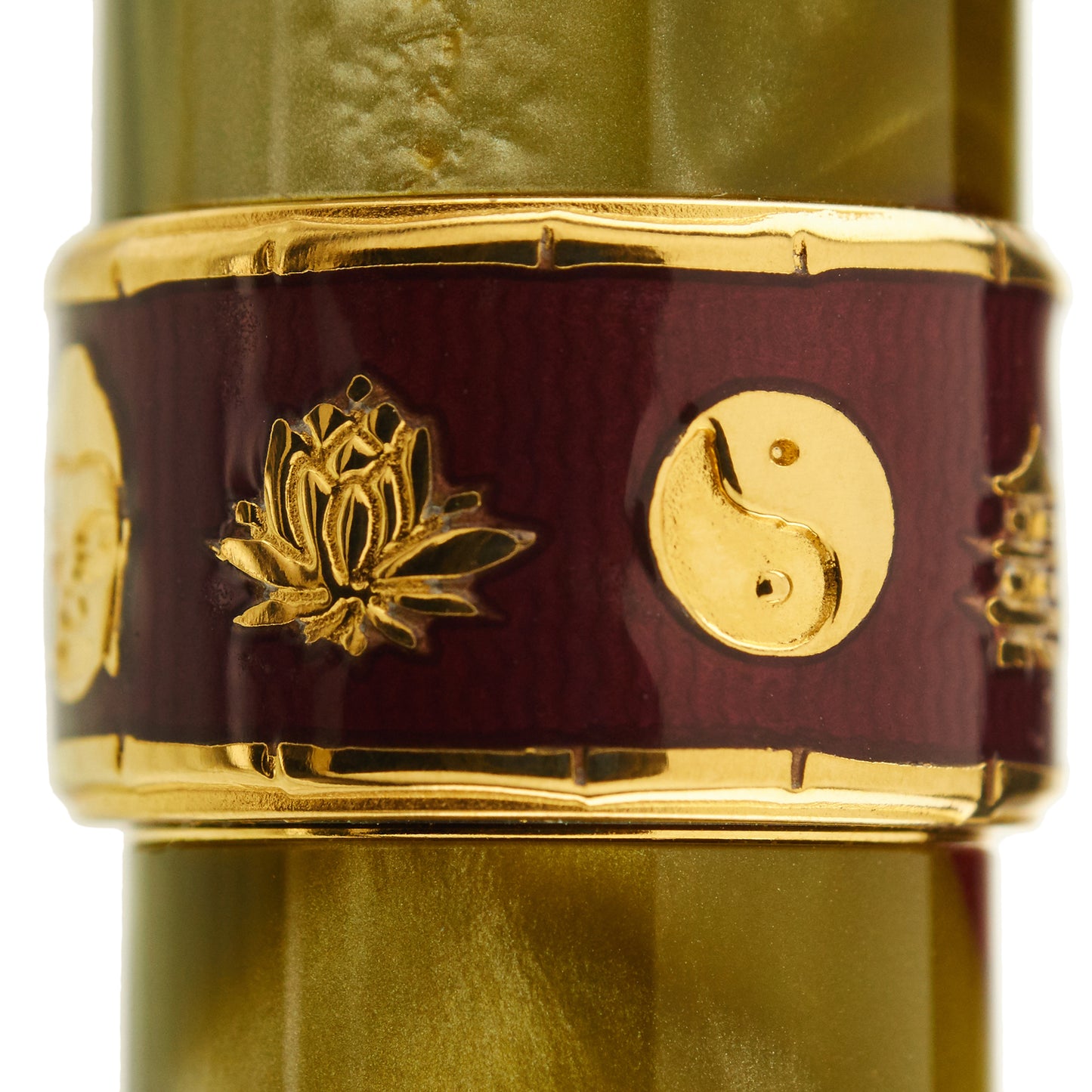
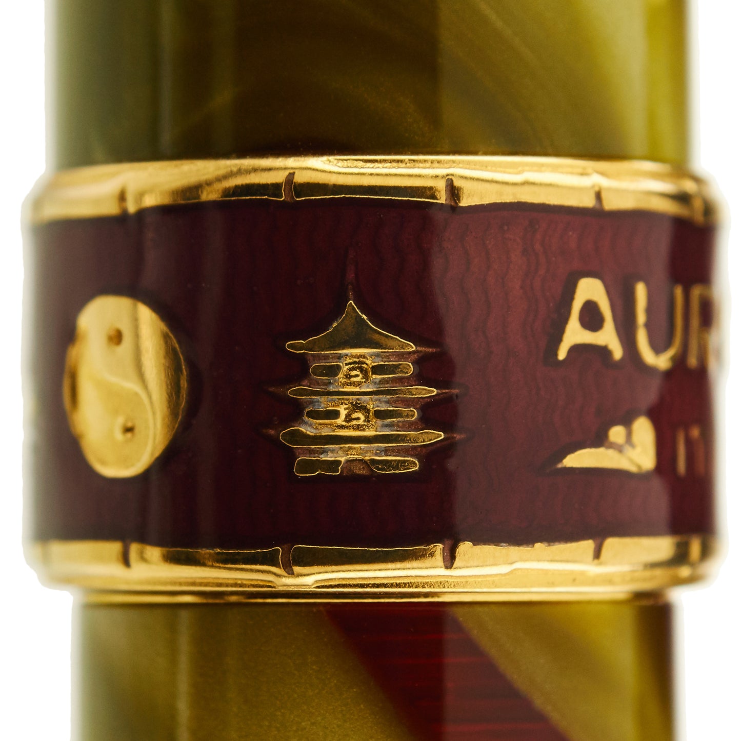
The cap band has a hard enamel coating. This band has an Asian motif, with bamboo as a border and depictions of a fan, Buddha, a lotus flower, and a pagoda.
The cap end and gripping section are finished with a rubberized burgundy color surface that adds to the comfort of this pen in the hand.
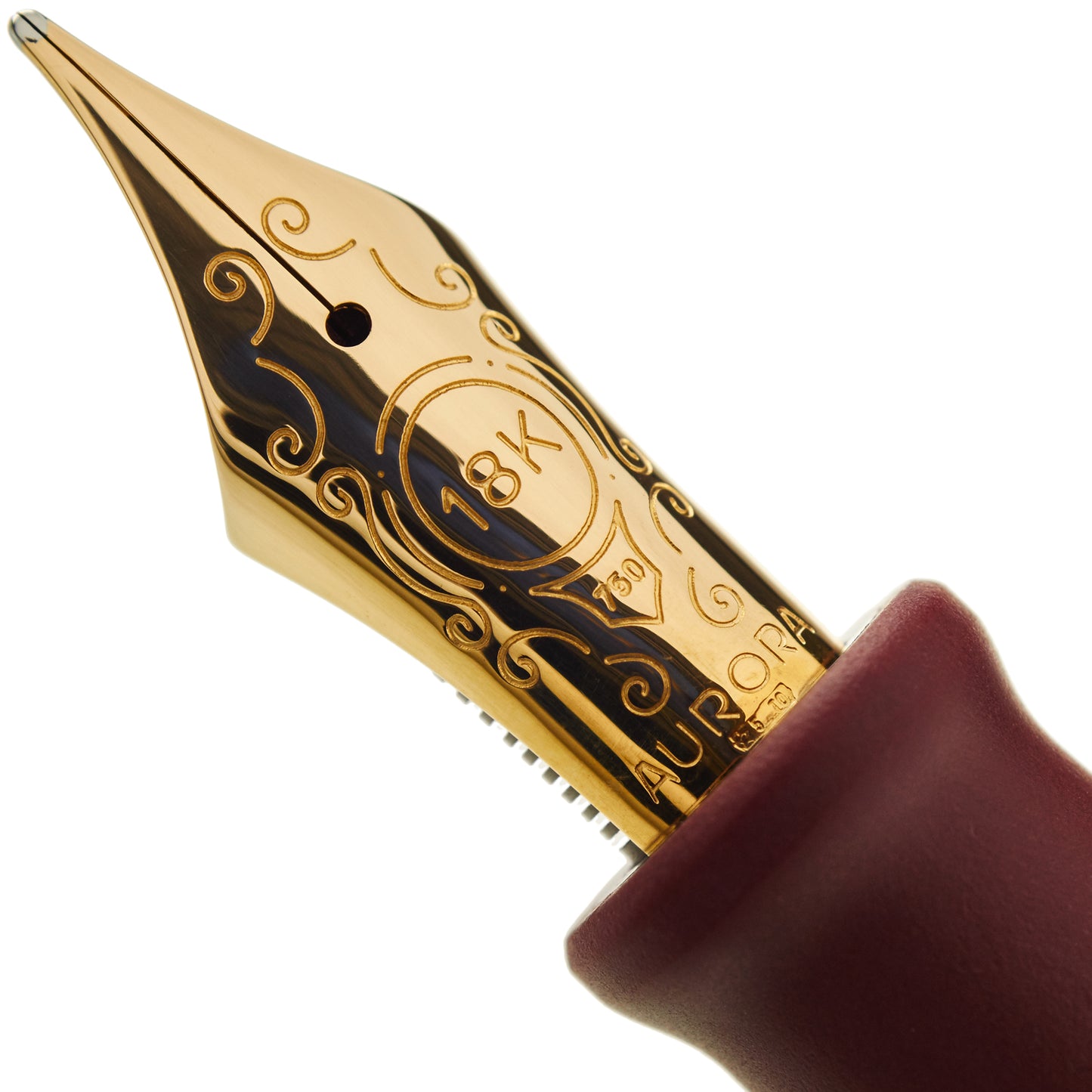
The Aurora Asia is provided with your choice of any of Aurora's Large 18k gold nib units.
Aurora nib units are designed to be easily interchangeable - see our Aurora nibs page for pricing on additional nib units.


