






Customization Guide
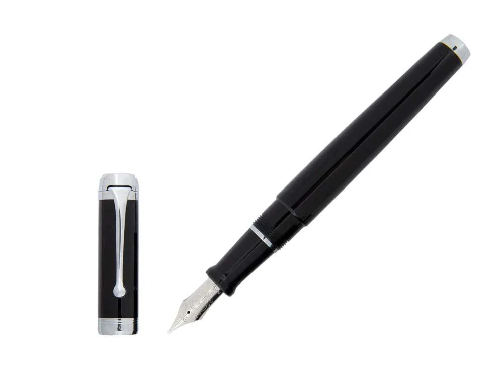
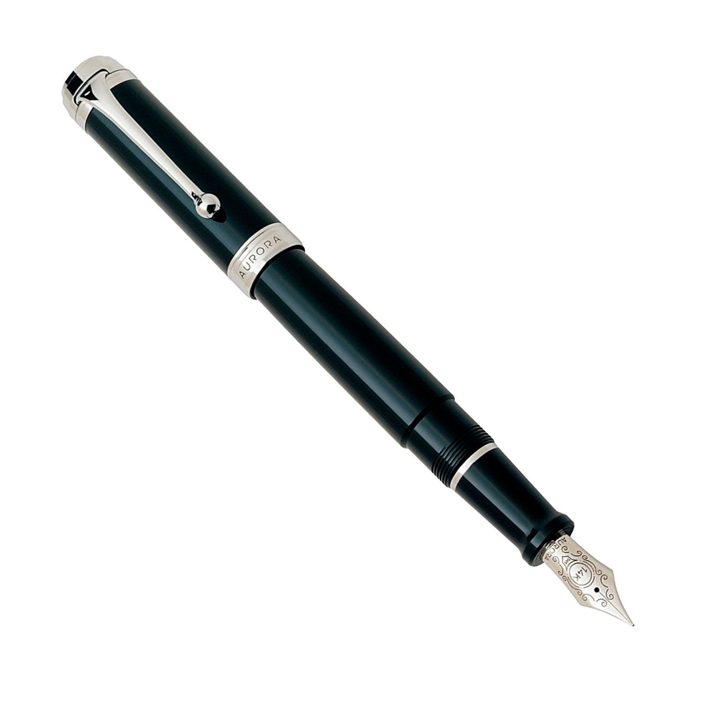
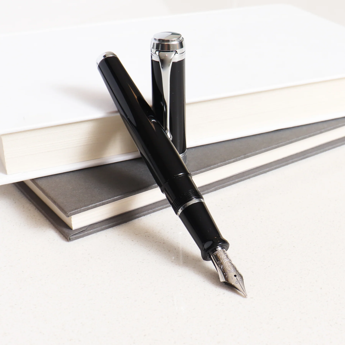
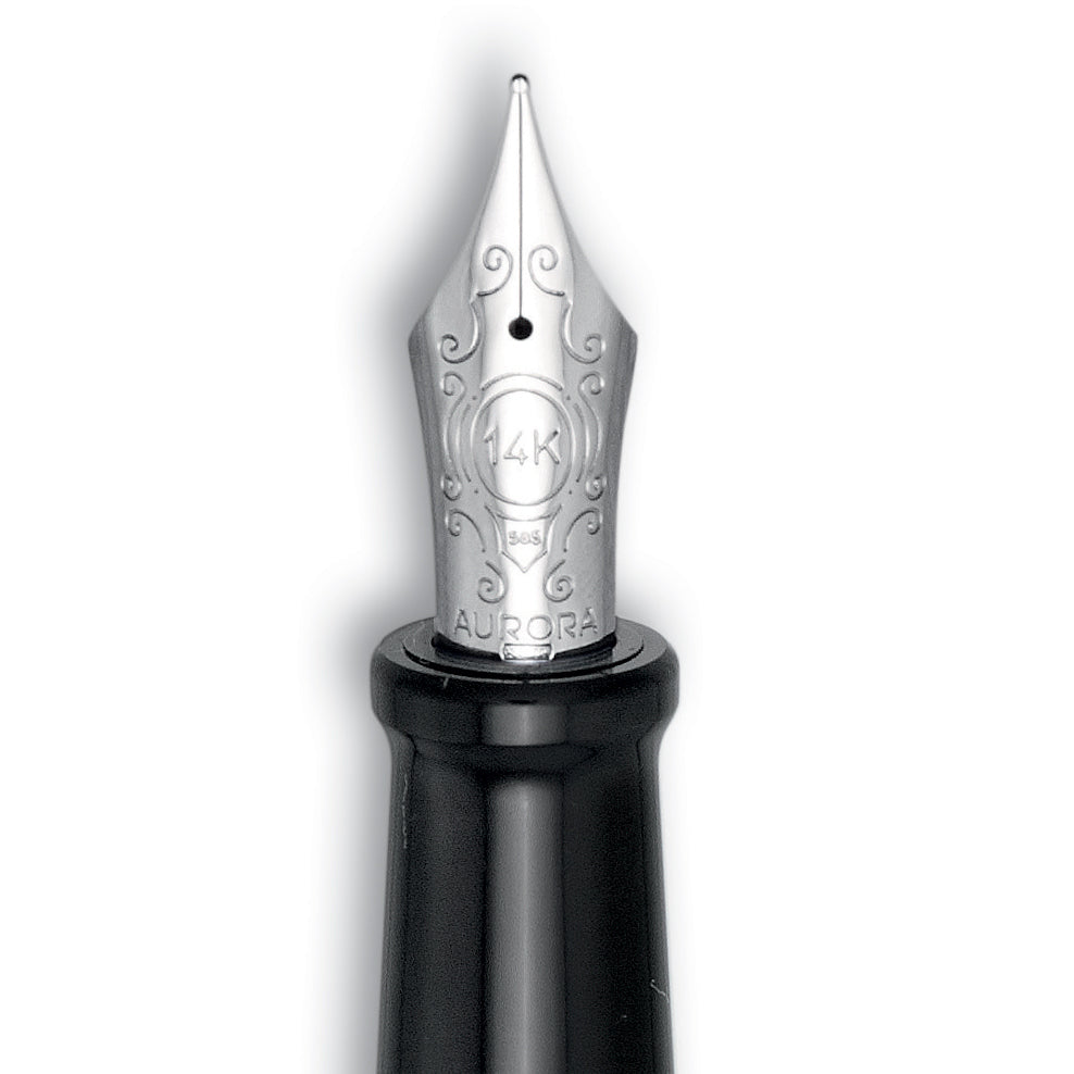
Most fountain pens are provided with standard stock nibs ranging in size from Fine to Medium to Broad, with Extra-Fine, Double-Broad, Stub, and Music sizes also common (experienced pen users can check out our tipping sizes page for exact comparisons among the pen lines we carry).
Most stock nibs are designed to give a consistent, unvarying line. But some users, such as artists, calligraphers, or just anyone who wants to add more personality and distinctiveness to their writing, are attracted to fountain pens precisely for the ability to use customized nibs which provide for varying line-widths.
If you are happy with a consistent, unvarying line with your pen, then most likely you will not have any immediate need for a customization. But if you want to achieve line-width variation, you will most likely be considering a customization to Stub, Italic, or Oblique points, and possibly considering adding flex as well. Other customizations can be as simple as a regrind, to make a broader nib more fine, or, less commonly, a retip, to make a finer nib more broad.
In general, the broader the nib point you start from, the more line-width variation you’ll see after customization. These customizations provide for more creativity and individuality in a pen-user’s writing - but they can also be more demanding in terms of the user’s ability to control and handle the pen.
The below guide illustrates the differences between a standard, unmodified nib and its customized variations.
Stub

|
Above is the same size nib after a regrind to Stub. A regrind to Stub is often a good place to start for your first customization. A Stub nib provides broad down-strokes and narrow cross-strokes while writing, and is less position-sensitive on the paper than the crisper and slightly more demanding cursive italic.
|
Cursive Italic

|
More demanding, but also providing crisper edges and more line-width variation, is the very popular customization to Cursive Italic. This also provides broad down-strokes and narrow cross-strokes, but is also more position-sensitive in terms of how the pen is held and requires more skill on the part of the user. This is a common customization for artists and calligraphers, but is still smooth enough to make for a good everyday writer.
|
Formal Italic
 |
Formal Italic is an even crisper and more demanding customization than either cursive italic or left oblique, and is usually utilized for calligraphy and by the most experienced users. This provides broad down-strokes and narrow cross-strokes, with even crisper corners and edges than a cursive italic - this is an extremely position-sensitive customization.
|
Left Oblique
 |
Commonly used for signatures and correspondence, the Left Oblique customization provides broad diagonal strokes and narrow cross-strokes, and like a cursive italic, is more position-sensitive and demanding than a stub. The whole pen must be rotated to the left in order to write smoothly, without skipping. The "Left" in Left Oblique refers to the cut of the nib itself, and does not refer to the handedness of the writer. |
Architect's Point (Also for Arabic and Hebraic writing)
 |
A more exotic regrind is that to Architect’s Point. Named after the style of writing used by Frank Lloyd Wright, this regrind is the opposite of cursive italic, and provides for broad cross-strokes and narrow down-strokes. This also tends to be a particularly useful customization for those practicing Arabic or Hebraic calligraphy. |
Spencerian
 |
Perhaps our most popular customization, but also one of the most advanced, the Mottishaw Spencerian Customization has gained special attention from being featured in a customer's YouTube video which has now received over twelve million views! The Spencerian starts from a semi-soft 14k nib and adds additional flex and a regrind to needlepoint to create a specialized writing point used for copperplate calligraphy. For more details, visit our special Spencerian page.. |


