Nakaya
Nakaya Portable Writer Maple Leaves
Nakaya Portable Writer Maple Leaves
The Nakaya Archive
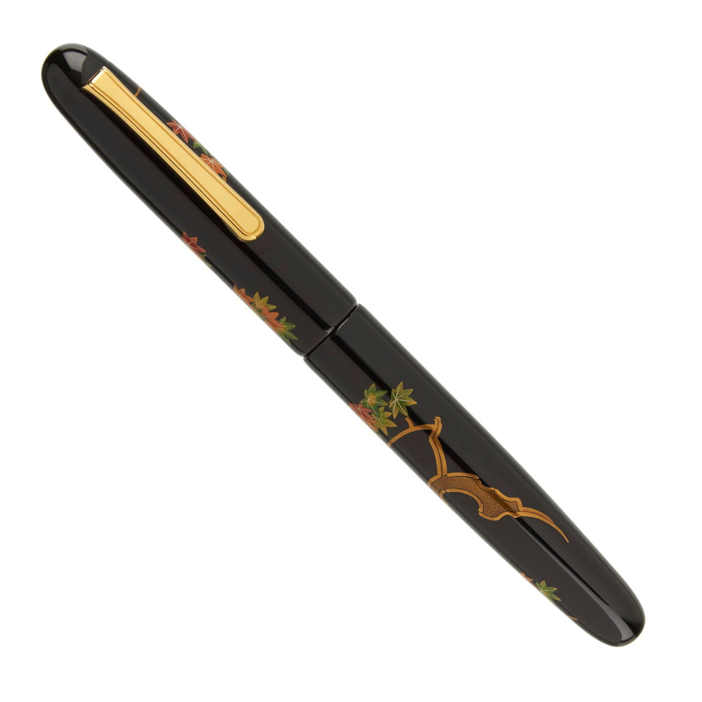
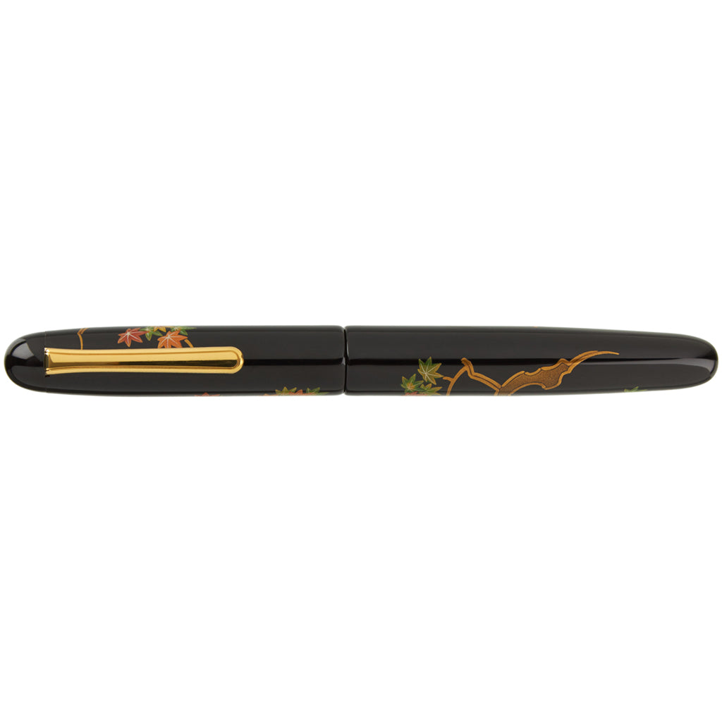
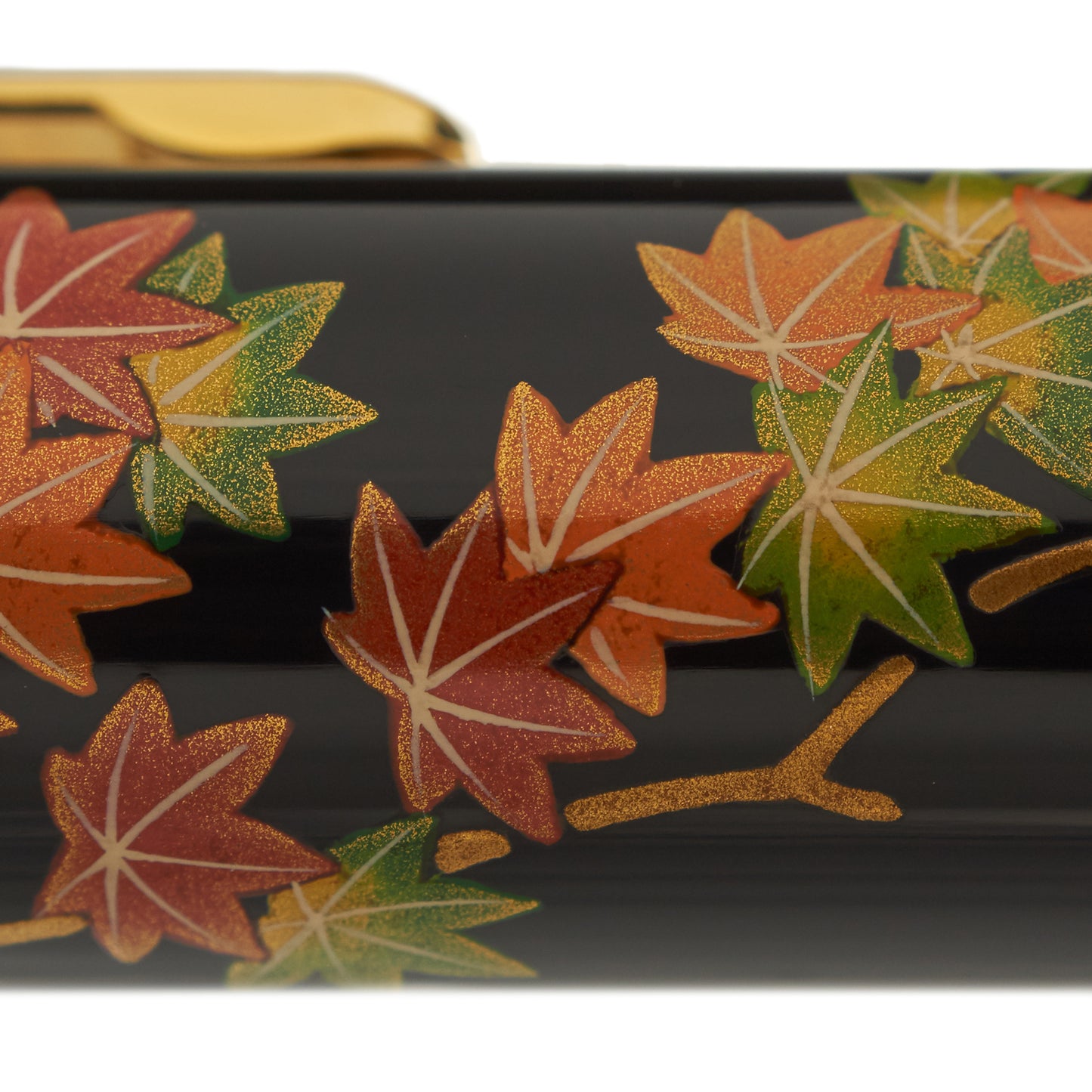
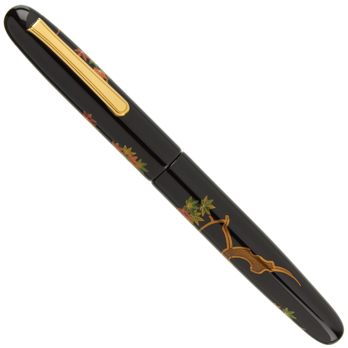
With a deep black urushi coat and a vivid motif, the Nakaya Portable Writer Maki-e Maple Leaves resonates with a quiet beauty. Maple leaves are one of the most popular depictions used in traditional Maki-e, and this is a rendering of the highest order.
The Nakaya Portable Writer Maki-e Maple Leaves fountain pen is a spare hand painted depiction. The spaces between the colors are as important as the maple figures.
The detailed lacquer introduces a texture on top of the glossy lacquer base. After drawing the motif using Urushi lacquer, the craftsman rubs colored Urushi onto the motif as it begins to set. Then the colored Urushi is carefully polished and rubbed with Shu-ai Urushi over the pen once more. Lastly, the craftsman creates veins by applying light colored Urushi with a brush. All of this is then carefully and meticulously polished as the final step.
Warm hues of orange, gold, and green contrast with the black urushi, making the artwork ""pop"". The smooth, Portable shape is an excellent showcase for the maki-e.
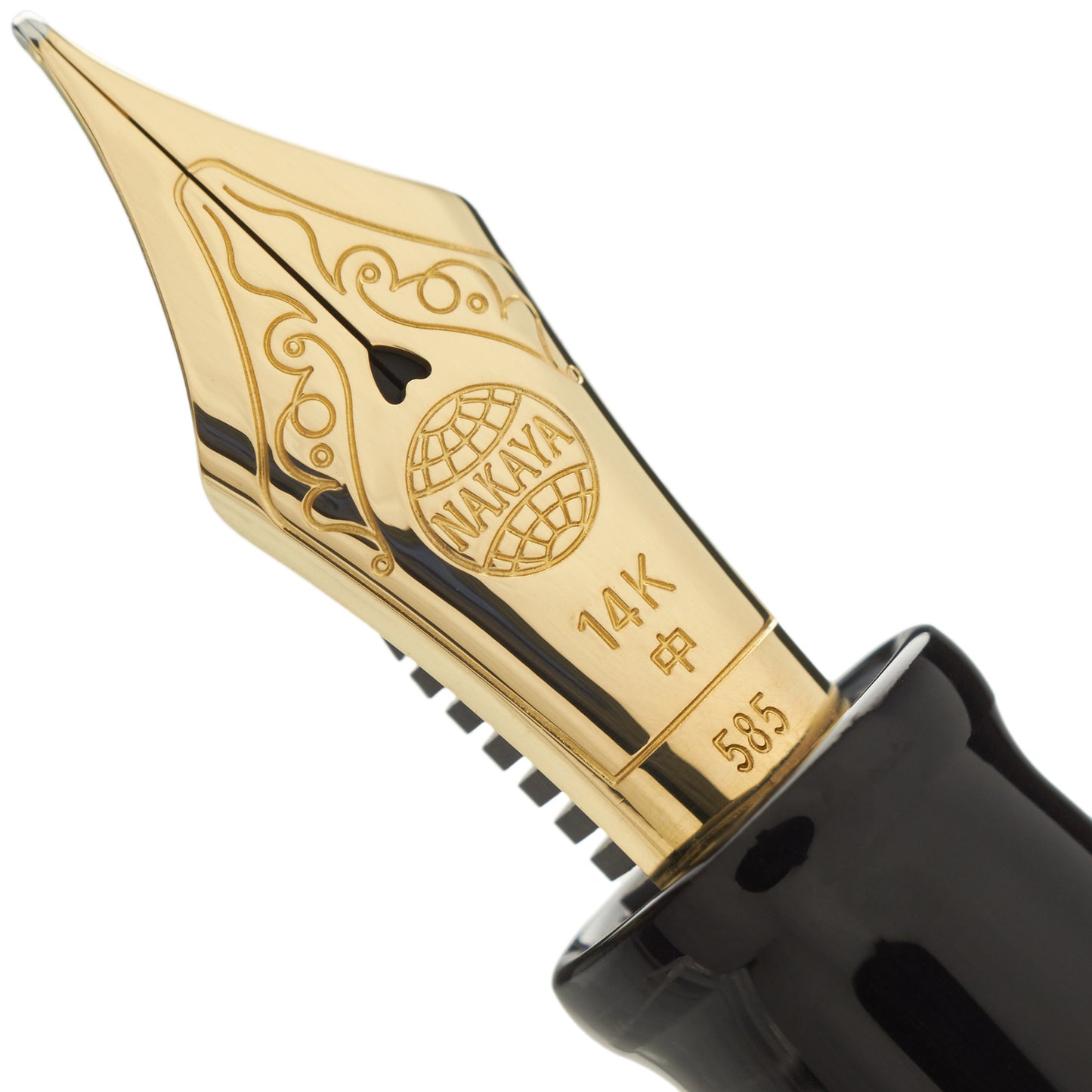
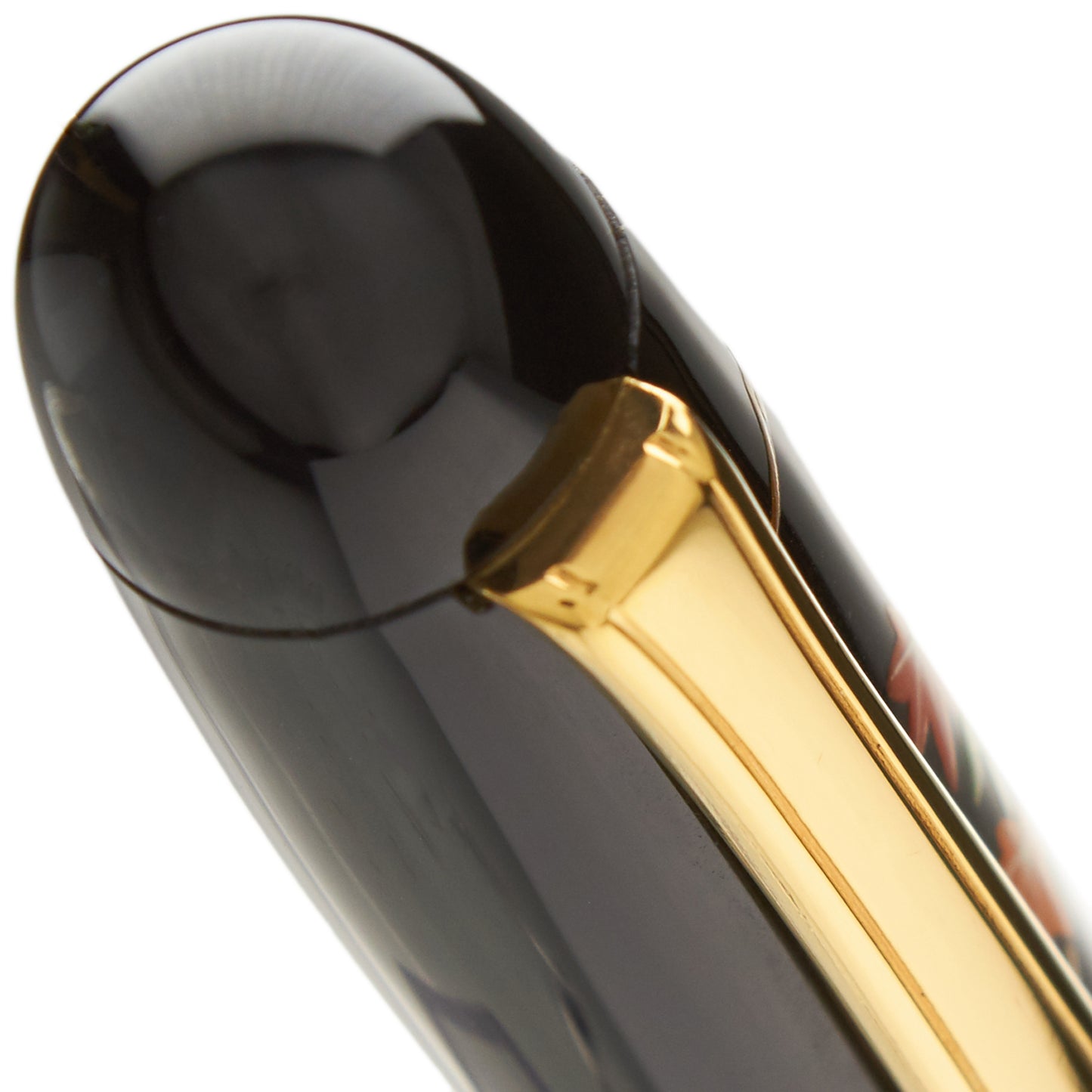
The Portable Writer Maki-e Maple Leaves can be filled with bottled fountain pen ink using the provided converter. Nakaya pens can also use Platinum brand top quality ink cartridges. Hand-painted Maki-e converters are also available. A gold clip brings out this writing instrument's warmth and also serves as a built-in roll stopper.
Maki-e, literally ""sprinkled powder,"" is a general term for the process by which figurative or abstract designs are created by sprinkling pigment or metallic powder onto the surface of urushi lacquer while it is still wet.
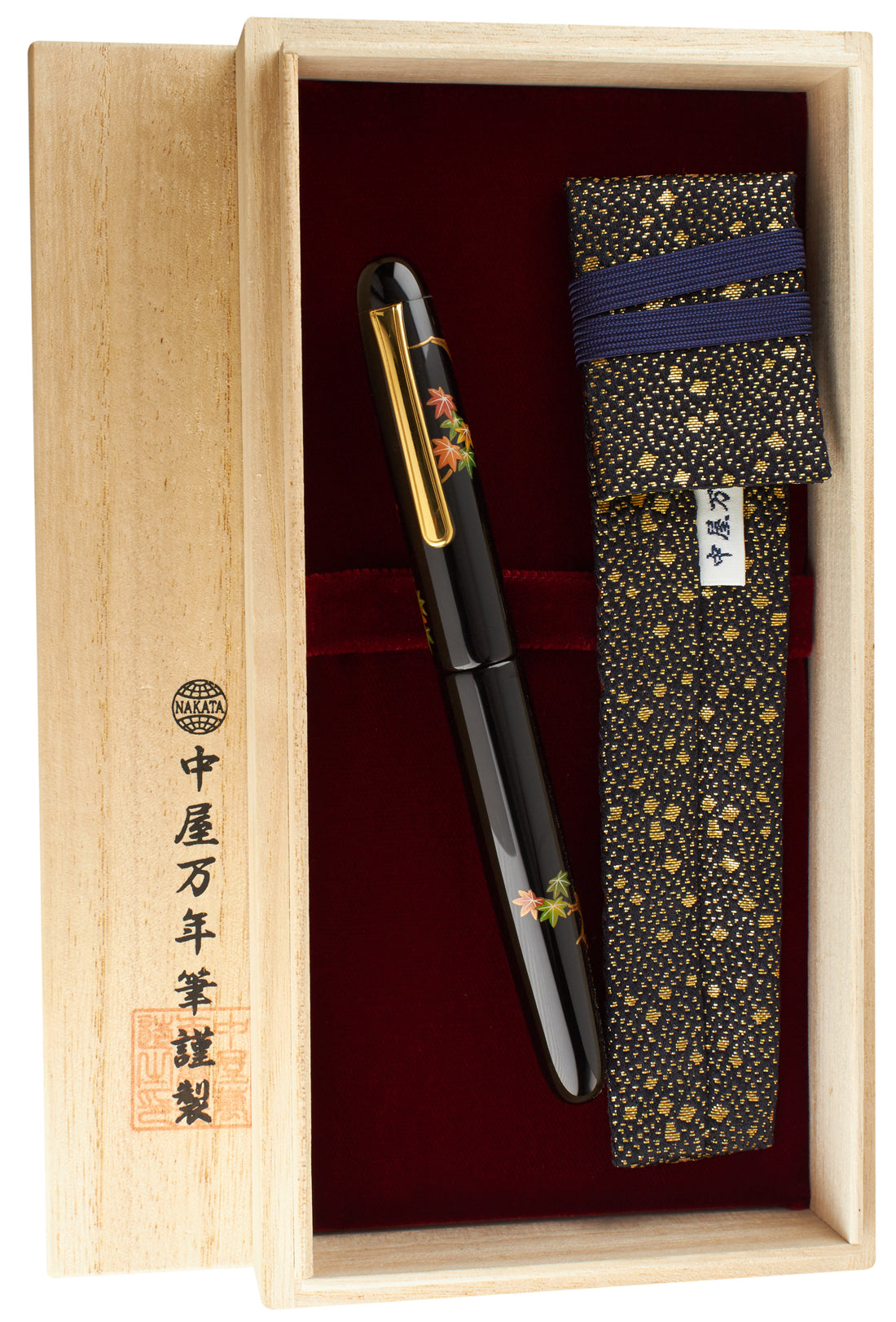
Nakaya pens ship in a solid softwood shipping box decorated with Japanese Kanji script and lined with decorative rice paper. A fabric pen ""kimono"" and starter box of Platinum brand cartridges are also included, making this pen a lovely presentation item. Sensible and elegant packaging has long been a hallmark of the Nakaya brand.
Nakaya pens are individually handcrafted in a process that requires a minimum of three to six months and often much longer.
Unless requested otherwise, each pen or nib you purchase from us will be carefully examined, tested, and optimized for your personal writing characteristics before it ships.
Filling System
Filling System
Cartridge-Converter
Share
