Customization Guide
Stub

|
Above is the same size nib after a regrind to Stub. A regrind to Stub is often a good place to start for your first customization. A Stub nib provides broad down-strokes and narrow cross-strokes while writing, and is less position-sensitive on the paper than the crisper and slightly more demanding cursive italic.
|
Cursive Italic

|
More demanding, but also providing crisper edges and more line-width variation, is the very popular customization to Cursive Italic. This also provides broad down-strokes and narrow cross-strokes, but is also more position-sensitive in terms of how the pen is held and requires more skill on the part of the user. This is a common customization for artists and calligraphers, but is still smooth enough to make for a good everyday writer.
|
Formal Italic
 |
Formal Italic is an even crisper and more demanding customization than either cursive italic or left oblique, and is usually utilized for calligraphy and by the most experienced users. This provides broad down-strokes and narrow cross-strokes, with even crisper corners and edges than a cursive italic - this is an extremely position-sensitive customization.
|
Left Oblique
 |
Commonly used for signatures and correspondence, the Left Oblique customization provides broad diagonal strokes and narrow cross-strokes, and like a cursive italic, is more position-sensitive and demanding than a stub. The whole pen must be rotated to the left in order to write smoothly, without skipping. The "Left" in Left Oblique refers to the cut of the nib itself, and does not refer to the handedness of the writer. |
Architect's Point (Also for Arabic and Hebraic writing)
 |
A more exotic regrind is that to Architect’s Point. Named after the style of writing used by Frank Lloyd Wright, this regrind is the opposite of cursive italic, and provides for broad cross-strokes and narrow down-strokes. This also tends to be a particularly useful customization for those practicing Arabic or Hebraic calligraphy. |
Spencerian
 |
Perhaps our most popular customization, but also one of the most advanced, the Mottishaw Spencerian Customization has gained special attention from being featured in a customer's YouTube video which has now received over twelve million views! The Spencerian starts from a semi-soft 14k nib and adds additional flex and a regrind to needlepoint to create a specialized writing point used for copperplate calligraphy. For more details, visit our special Spencerian page.. |
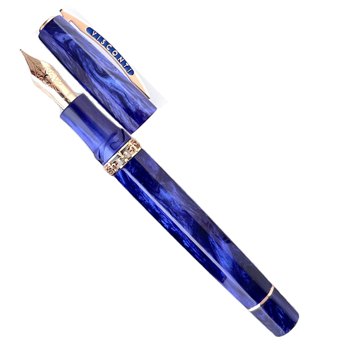
Visconti is excited to announce the launch of the new Medici Viola Limited Edition crafted from yet another exquisite resin by Jonathan Brooks, of the Carolina Pen Company. This U.S. exclusive, violet-hued edition is limited to 88 pieces and is available as a fountain pen only.The Medici rulers of Florence were influential patrons of the arts, who fostered a culture of creativity and innovation in the Renaissance period. The Visconti Medici Viola collection pays homage to this important dynasty by crafting a collection of luxury pens that embodies the spirit of artistic excellence and elegance that the Medici family represented.The Medici Viola features the new demonstrator central ring, made with the skeletonization technique, featuring the official emblem of Florence, the lily. This symbol, found on the city's coat of arms, represents beauty, nobility and pride. "Viola," Italian for "purple," was chosen for its indelible link to the city. The Medici Viola fountain pen features a capacious power-filler double reservoir and Visconti's 18kt gold in-house nib with rose gold plating, available in EF, F, M, B, and Stub widths.

